Whangamata Ratepayers Association
The Whangamata Ratepayers Association approached me to develop a fresh brand identity and an online platform that better represented their mission and connected with the community. The goal was to create a professional, modern, and approachable look while providing a website that effectively communicated their work, news, and initiatives.

The Result

Brand & Logo Update
Designed a new logo to visually capture the Association’s mission and community focus.
The logo represents movement in waves — inspired by the land and sea we live near — while also symbolising the voices of the community.
A subtle speech bubble element was incorporated to represent views, opinions, and conversations, reflecting the Association’s role in amplifying the community’s voice.
Developed a cohesive colour palette, typography, and style guide for consistent use across print, digital, and event materials.
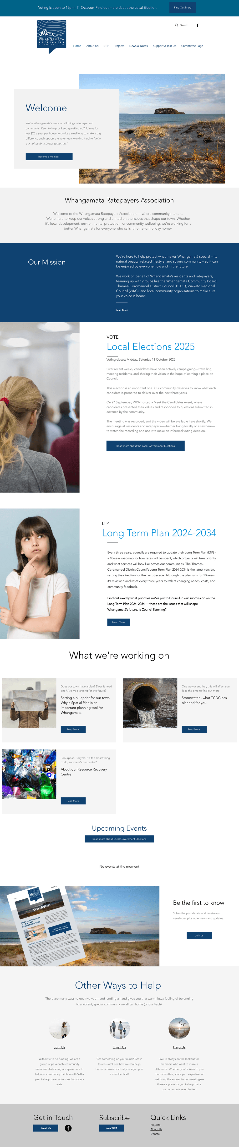
Website
The previous website contained a lot of information and resources, but lacked a consistent structure and clear flow, making it difficult for the community to navigate.
Redesigned and updated the site on the existing WIX platform to create a cleaner, more cohesive look that aligns with the refreshed branding.
Improved navigation and layout to help the community easily find information and focus on the WRA’s committees, project priorities, and key initiatives.
Ensured the website was user-friendly, mobile-responsive, and visually engaging to encourage ongoing community engagement.
Impact
The new brand and website have positioned the Whangamatā Ratepayers Association as a modern, professional, and approachable community organisation. The refreshed identity and digital presence have strengthened communication, increased engagement, and provided a cohesive platform for ongoing community advocacy.
